 Sheet 1
Friday, 30 April 2010


Evaluation Task
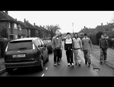
This shot was one of the only shots we did that took one take. We felt it neccessary to hold it for a little longer than the others to add to the effect of a long shot. This was taken in the same locationan as the rest of our shots. we felt it was a an effective idea to put it in black and white to give it a darker feel as this was the desired effect.
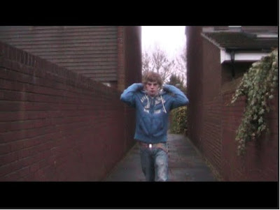
This shot was taken a the first of a three shot sequence. We felt a mid shot was appropriate to give a general view of the scene aswell as the character. This was an unusual technique to use in a teaser trailer but we felt the sequence was approriate to give the audience an insight to the narrative. The fact that the alleyway is quite narrow also means that the shot looks almost surreal at points contributing to the idea of helpness which was the intended message in this shot and sequence.
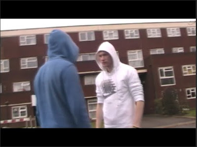 This shot was an interesting one. It took a number of attempts to get right but we felt it was quite original. The content of the shot is a full 360 degrees around the two subjects and gives the intention of violence an extra edge that makes it particularly effective. The shot idea was originally gained from the film adulthood but we adapted it to fit our own purposes for the trailer.
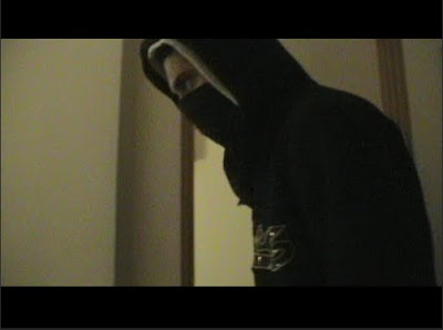 This shot is possibly one of the more aggressive and threatening of the trailer. It uses the simple camera movements of a sideways pan to follow the action on screen. We used low lighting to raise connotations of a darker scene and the action on screen suggests this.
 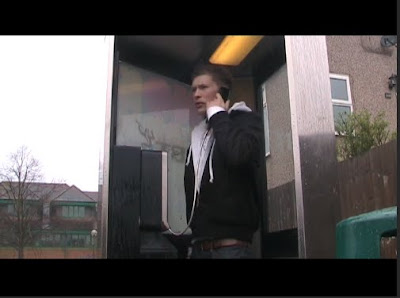 This shot is a low angled shot and again was part of a three shot sequence. We later added a voice over for the dialog as we considered this to be a good use of time. It vastly improved the quality of the general sound and ensured that any interference was illiminated. we held the shot a little longer than we did for others as it is a pivotal moment in the films narrative. It is also a very heavily lit shot so every elment of the cosyume had to correct.
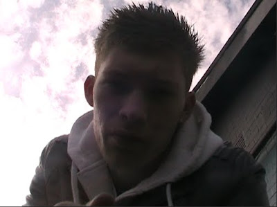 This was a particularly hard shot to get right. As its an extreme low angle it was impossible for the person operating the camera to see the shot. Therefore it was down to guesswork how to do the shot. eventually we got it right however and we feel the end product was worth it. We didn't use a voice over in this shot as the subject was so close to the microphone we didnt feel it neccessary. The light from behind also gives a silouette effect which contributes to the mood created.
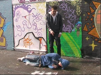 This is second shot of a two shot sequence and is the last longer shot og the trailer. It is held for 3 seconds and we decided on a mid shot as it helps include everything we wanted in the shot. We also used a small pan movement to follow one of the subjects out of the scene towards the end of the scene.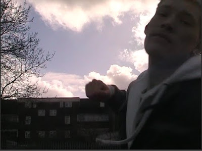
This is everyones favourite shot of the production. It is possibly the shortest shot but involves the subject punching the screen of the camera and the relaease date appearing as a result. we borrowed the idea from the teaser trailer for 'Shank' and we personally feel we easily matched the quality. The camera is in a low angle position and we did this to get the sky in the background as back lighting. This effect is possibly the most fitting for any shot in the entire production.
 This shot is a long shot of one of the characters. It is used as a mood shot at the very beggining to set the genre of the production aswell as give a hint to the general content. This is before the soundtrack drops and is used as an oppertunity to build a mood in the trailer. We believe this worked effectively and created the mood intended.
By Alex, Matt H, Matt R.
Thursday, 29 April 2010

Thursday, 22 April 2010

Tuesday, 20 April 2010
Editing Analysis
The editing software was changed this year and therefore meant that the process was completly new to us. This however, was only small issue to overcome and the combined use of the Fruity Loops music technology meant that there was a definite improvement in the quality of the final result.
We tried to ensure that we created a montage effect that leave the audience in confusion as to what they had just seen. This would then lead to a mass nterest in the films narrative and genre producing a much higher profile for the film and its market.
The transitions used are generally the same ranging between fade to black and a simple cut to ensure the trailer is not to complicated in its approach. We also edited the light balance in many of the shots to create different effects to our own purposes such as creating darker scenes to procure deeper emotion.
Mixing the sound with the trailer was a difficult task as during priods of dialog we had to fade it in and out perfectly so as to keep each file audable. This meant literally having to mix the two together andraising the volume of each where appropriate.
If we had more time we would improve the order in whic we placed our shots. we found later that there were better ordrs in which the shots fitted but due to lack of time were unalble to do so.
We tried to ensure that we created a montage effect that leave the audience in confusion as to what they had just seen. This would then lead to a mass nterest in the films narrative and genre producing a much higher profile for the film and its market.
The transitions used are generally the same ranging between fade to black and a simple cut to ensure the trailer is not to complicated in its approach. We also edited the light balance in many of the shots to create different effects to our own purposes such as creating darker scenes to procure deeper emotion.
Mixing the sound with the trailer was a difficult task as during priods of dialog we had to fade it in and out perfectly so as to keep each file audable. This meant literally having to mix the two together andraising the volume of each where appropriate.
If we had more time we would improve the order in whic we placed our shots. we found later that there were better ordrs in which the shots fitted but due to lack of time were unalble to do so.
Analysis of Camera shots, angles and transitions.
Our production of a teaser trailer had many interesting elements that helped it fit into the teaser triler conventions aswell as insuring it hd its own unique sales points. The camera work was a key factor in creating these effects and we felt that as this can often be the most acclaimed area of a production it was very important we delivered a range of meaningful and interesting shots, angles and transitions.
As we failed in our ancillary task to include a 360 degree angle shot we wanted to include it in this production. It took many attempts to get the overall speed, height and width of the shot perfect but in the end alongside the transition e have used the shot is very impressive. We did also alter the speed of the shot later in the editing suite to produce a more flowing effect.
We also tried to ensure that all of our shots lasted no longer than five seconds as the idea ofour trailer was to create a fast flowing montage of shots that leave alot of unanswered questions about the film itself. The use of the cut and fade to black shot transitions assisted in this desired effect as the rapid change of scene produces a rapid change of emmotion.
The final shot of the trailer is possibly the most impressive. The idea was actually borrowed from the trailer of the recently released 'Shank'. The idea is to give the genre and the release date of the film away all in one shot. we believe wecreated this effect perfectly and actually managed to make look as if it was professionally done.
As far as what we would improve goes we feel that there are certain shots that could have be improved through a different use of angles. The connotations raised by some of the shots are those we intended to create and therefore it affects the purpose of the trailer and narrative. Although this is not a major problem it still leaves much out of place within the trailer and should we get the oppertunity we would certainly make ammendments.
As we failed in our ancillary task to include a 360 degree angle shot we wanted to include it in this production. It took many attempts to get the overall speed, height and width of the shot perfect but in the end alongside the transition e have used the shot is very impressive. We did also alter the speed of the shot later in the editing suite to produce a more flowing effect.
We also tried to ensure that all of our shots lasted no longer than five seconds as the idea ofour trailer was to create a fast flowing montage of shots that leave alot of unanswered questions about the film itself. The use of the cut and fade to black shot transitions assisted in this desired effect as the rapid change of scene produces a rapid change of emmotion.
The final shot of the trailer is possibly the most impressive. The idea was actually borrowed from the trailer of the recently released 'Shank'. The idea is to give the genre and the release date of the film away all in one shot. we believe wecreated this effect perfectly and actually managed to make look as if it was professionally done.
As far as what we would improve goes we feel that there are certain shots that could have be improved through a different use of angles. The connotations raised by some of the shots are those we intended to create and therefore it affects the purpose of the trailer and narrative. Although this is not a major problem it still leaves much out of place within the trailer and should we get the oppertunity we would certainly make ammendments.
Sunday, 18 April 2010
Production Evaluations (post production)
Film Poster
We spent a long time creatin a film poster which would stand out in a crowd and leave a lasting image in the head of passers by. To do this we had to make it bold, colourful, and eye catching. We used photoshop to add layers; distorting the edges of the of the image and outlines, and increasing the saturation and contrast of the colours. The image we used lets the audience knows what the charcters are about, with Alex the main character frowning at the front with his arms folded. The other two characters are situated either side of him in an agressive stance. This creates a very serious mood which is reinforced by the bold lettering and font of the title of the film. 'West 10 Reloaded' is slapped straight across the middle of the poster and is very upfront.
'Britain's most dangerous postcode' the main quote of the film is located above it at the top of the page in smaller slanted typeface to leave the importance with the title. Film company logos are also included at the bottom of the page as we felt this would improve the realism of the poster, and works in further advertising the film. The basic, simplistic approach works well as it does not give too much away and delivers the main points across- the name and the characters of the film.
Magazine Front Cover
This was relatively difficult to produce as we knew we had to include many different things. As well as aqdvertising the film we had to also involve the use of promotions, competitions, etc to persuade people to buy the maagzine. The magazine front cover uses a much less agressive photo and also includes me, the cameraman, to let the audience know that this takes a far more technical approach to the film. Behind the scenes coverage and actor interviews are also put across boldly and at angles to interest the reader.
As with the magazine front covers i have analysed the bar code, issue number and price were all included in smaller font and without colour to keep the interest with the film being advertised. Heavy use of punctuation, alliteration and other literate techniques are used with the text to to attract an educated audience.
We spent a long time creatin a film poster which would stand out in a crowd and leave a lasting image in the head of passers by. To do this we had to make it bold, colourful, and eye catching. We used photoshop to add layers; distorting the edges of the of the image and outlines, and increasing the saturation and contrast of the colours. The image we used lets the audience knows what the charcters are about, with Alex the main character frowning at the front with his arms folded. The other two characters are situated either side of him in an agressive stance. This creates a very serious mood which is reinforced by the bold lettering and font of the title of the film. 'West 10 Reloaded' is slapped straight across the middle of the poster and is very upfront.
'Britain's most dangerous postcode' the main quote of the film is located above it at the top of the page in smaller slanted typeface to leave the importance with the title. Film company logos are also included at the bottom of the page as we felt this would improve the realism of the poster, and works in further advertising the film. The basic, simplistic approach works well as it does not give too much away and delivers the main points across- the name and the characters of the film.
Magazine Front Cover
This was relatively difficult to produce as we knew we had to include many different things. As well as aqdvertising the film we had to also involve the use of promotions, competitions, etc to persuade people to buy the maagzine. The magazine front cover uses a much less agressive photo and also includes me, the cameraman, to let the audience know that this takes a far more technical approach to the film. Behind the scenes coverage and actor interviews are also put across boldly and at angles to interest the reader.
As with the magazine front covers i have analysed the bar code, issue number and price were all included in smaller font and without colour to keep the interest with the film being advertised. Heavy use of punctuation, alliteration and other literate techniques are used with the text to to attract an educated audience.
Subscribe to:
Posts (Atom)