Through what people have told us I am satisfied that the end product is a successful one. I am also aware of the improvements that could have been made to our work, and can take these factors on board before next starting a project of this scale.
Due to the time limit that we were working to, and the fact we taking multiple shots of each shot so we could later pick which one was most effective, we were a little rushed to say the least. On top of this with it being a teaser trailer we had to include much more shots than we were used to, as apposed to fewer, more extended shots, as with previous projects. It did at times become challenging to fit this all in and focus on aspects such as lighting and scenery at all times, so i can appreciate and accept the points being raised. We do not feel this slight lack of concentration however damaged our overall production too severly as we are extremely pleased with the quality of the shots we dedicated so much time and effort to, and we feel this reflects our commitment to the teaser trailer.
I have learned a lot about the technology used to create media films and other products and enjoyed how interactive the blog is. I have watched many other groups teaser trailers and made comments on what I think their strengths and weaknesses are and am pleased to see other people take the time to evaluate our own, as this all helps in the long run. I feel my personal level of creativity has progressed since the beginning of the coursework, and am looking forward to expanding on these ideas at higher education.
The university course i have applied for uses media and representations as it is largely based around television, radio, and newspapers. Therefor the skills that I have learned over the last two years are going to be of great importance as I go into university, with the vision of a career in the media industry becoming ever more clearer.
Friday, 30 April 2010
Further Audience Feedback (Post Production)

First of all one of our external actors, Rafid Valenciano uploaded the video onto facebook, a popular social networking website. This came up on Matt Rayburn's page, where friends and fellow students could easily share their comments and opinions.

Next i went a step further and asked for people's views on my status, as a way of gaining extra audience feedback, as my print screen above shows. My friend Markus who is also a media studies student at another school was kind enough to share his opinion on our work. This form of media convergance is a good way of getting broader ideas and displaying them on my blog. It is interesting to see how the different platforms and technologies can be interlinked to our advantage.
The Marketing Campaign (Post Production)
The three pieces of work that we produced ultimately all work as one when you consider how they advertise the film. Marketing is about reaching out and grabbing as many customers as possible, and we believe we have achieved this by applying our film to different forms of media. The teaser trailer would feature in cinemas, on the internet and possibly some television channels, meaning it would mainly be seen by a younger audience. The film poster would be seen on buses and phone boxes, and so available to all members of the public. The magazine we used was 'gentleman's quarterly,' meaning males of varied class and different interests would find out about the film. So despite aiming our film at a specific audience, it would in theory make itself known to just about everyone, and word of mouth is a great way of creating hype, whatever the subject matter.
The teaser trailer gives the audience indicators of the narrative and characters as a build up but never really gives away an end result. This would spark interest from the audience who would want to research into the film to find out a more detailed account of what it's about.
The three main characters introduced here also appear on the magazine front cover and poster. The poster is very discreet but holds a firm ground in how it reflects the attitude and sincerity of the trailer. The name and slogan of the film are established most effectively through this as they are the only pieces of text that appear on the poster.
Meanwhile the magazine front cover shows it as an exciting upcoming cinematic event of great importance, just through the fact it dominates a highly respected magazine's front page. The way the cameraman/director is included in the shot as well as the actors, and also Rafid Valenciano's thoughtful pose suggests a more behind the scenes look at the film. The exclusive interviews that are adveritsed adds a very personal touch between viewer and actor as they can find out more about the opinions and inspirations behind the characters and narrative through this.
The way in which we linked these three pieces was by no means a coincedence. Each one gives away something slightly different about the film despite all selling the same product. Similarities can particularly be drawn between the poster and magazine front cover which correspond each other well in two ways. We purposely chose the same grafitti backdrop for the images as this not only sets up the film as very urban, but can also be easily recognised by the audience who would instantly think of 'West 10 Reloaded' whenever they saw either of the pieces. This location is also included in the trailer itself which would remind them of the poster/ magazine and vice versa, keeping it in their minds. The way in which the same 3 characters feature in all 3 is another example of this, and this would mean they would quickly become familiar faces in the world of cinema. Therefor we feel the campaign works well as each product compliments the other whilst offering something different; thus generating maximum interest and imposing itself upon a variety of audiences.
Overall Evaluation
I feel that in general we have met every aspect of a teser campaign. Each of our texts is reliant on another and we dont give much of the narrative away but just enough to create interest in the rest. We didnt base our magazine front cover on that of film magazine such as empire because we felt that that was to much of a niche market. We therefore considered a more general brand as this would reach a wider audience and not limit the potential sucsess of the production.
There are elements we would improve aswell such as the quality of our editing and the use of greater effects on the teaser poster. However we ran out of time to imrove these and therefore there is still room for improvement but on a whole i believe our campaign to have been a successful one.
There are elements we would improve aswell such as the quality of our editing and the use of greater effects on the teaser poster. However we ran out of time to imrove these and therefore there is still room for improvement but on a whole i believe our campaign to have been a successful one.
Evaluation of costume props and mise en scene
These elments are all integral to the reality of a production. It is generally thought to be important to simulate the situation you are producing realistically and make the audience believe that it really has happened. This is why we believed that we should dress our characters in a normal way but still maintain the link to genre. I feel we did this very effectively and what is happening on screen looks as if it really would happen on streets just like the ones the viewers would live on.
In terms of props we tried to limit this to the very minimum you would expect a youth in todays society to possess such as a mobil again to add to the reality. We did use a knife to provoke the thought of violence in the audiences mind and this then lead us to simulated aggression later in the trailer. We felt it important not to advertise actually using the knife as this is a very tender issue in Britain currently.
In terms of the chosen scenery we tried to ensure that each shot had a different location to create a sense of large scale drama that we desired. We have since been told that this is exactly what the trailer put across and that maybe we should alter the type of scene we base some of our shots in. To improve, this is what we would do.
Every Product In Our Campaign
One of the great things about our overall campaign is that every product compliments the other two. None make sense unless you have seen the other two. This technique was purposly done to raise the profile of our campaign in general. Therefore in a sense our ancillary tasks are just as important as the the main production task.
Each and every part of the campaign has been planned carefully to produce a domino effect that ultimatly leads to anyone who has viewed all three products beeing drawn into watching the film when it is released. We believed this to be quite a unique technique and havent seen any other group produce the same effect in the audience feedback tasks we have participated in.
Each and every part of the campaign has been planned carefully to produce a domino effect that ultimatly leads to anyone who has viewed all three products beeing drawn into watching the film when it is released. We believed this to be quite a unique technique and havent seen any other group produce the same effect in the audience feedback tasks we have participated in.


Evaluation Task
This shot was one of the only shots we did that took one take. We felt it neccessary to hold it for a little longer than the others to add to the effect of a long shot. This was taken in the same locationan as the rest of our shots. we felt it was a an effective idea to put it in black and white to give it a darker feel as this was the desired effect.
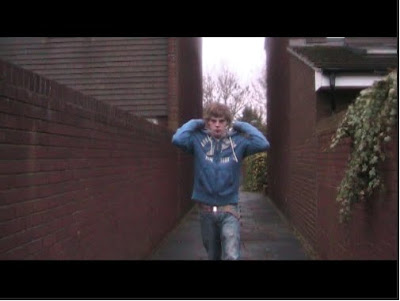
This shot was taken a the first of a three shot sequence. We felt a mid shot was appropriate to give a general view of the scene aswell as the character. This was an unusual technique to use in a teaser trailer but we felt the sequence was approriate to give the audience an insight to the narrative. The fact that the alleyway is quite narrow also means that the shot looks almost surreal at points contributing to the idea of helpness which was the intended message in this shot and sequence.
 This shot was an interesting one. It took a number of attempts to get right but we felt it was quite original. The content of the shot is a full 360 degrees around the two subjects and gives the intention of violence an extra edge that makes it particularly effective. The shot idea was originally gained from the film adulthood but we adapted it to fit our own purposes for the trailer.
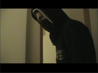 This shot is possibly one of the more aggressive and threatening of the trailer. It uses the simple camera movements of a sideways pan to follow the action on screen. We used low lighting to raise connotations of a darker scene and the action on screen suggests this.
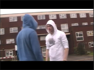
 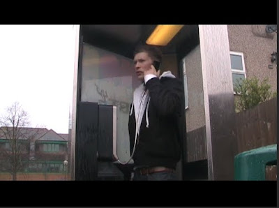 This shot is a low angled shot and again was part of a three shot sequence. We later added a voice over for the dialog as we considered this to be a good use of time. It vastly improved the quality of the general sound and ensured that any interference was illiminated. we held the shot a little longer than we did for others as it is a pivotal moment in the films narrative. It is also a very heavily lit shot so every elment of the cosyume had to correct.
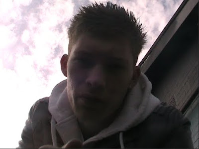 This was a particularly hard shot to get right. As its an extreme low angle it was impossible for the person operating the camera to see the shot. Therefore it was down to guesswork how to do the shot. eventually we got it right however and we feel the end product was worth it. We didn't use a voice over in this shot as the subject was so close to the microphone we didnt feel it neccessary. The light from behind also gives a silouette effect which contributes to the mood created.
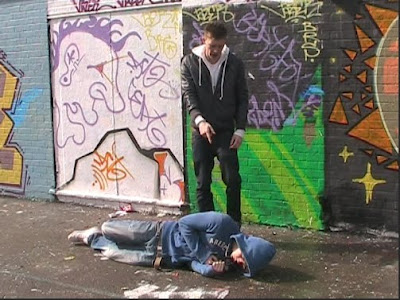 This is second shot of a two shot sequence and is the last longer shot og the trailer. It is held for 3 seconds and we decided on a mid shot as it helps include everything we wanted in the shot. We also used a small pan movement to follow one of the subjects out of the scene towards the end of the scene.
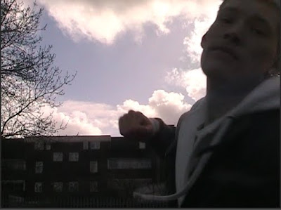
This is everyones favourite shot of the production. It is possibly the shortest shot but involves the subject punching the screen of the camera and the relaease date appearing as a result. we borrowed the idea from the teaser trailer for 'Shank' and we personally feel we easily matched the quality. The camera is in a low angle position and we did this to get the sky in the background as back lighting. This effect is possibly the most fitting for any shot in the entire production.
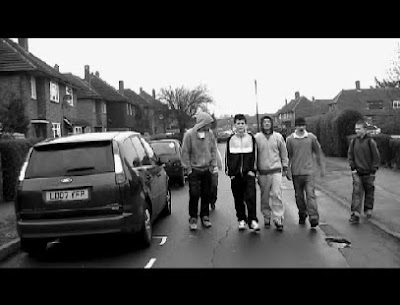
 This shot is a long shot of one of the characters. It is used as a mood shot at the very beggining to set the genre of the production aswell as give a hint to the general content. This is before the soundtrack drops and is used as an oppertunity to build a mood in the trailer. We believe this worked effectively and created the mood intended.
By Alex, Matt H, Matt R.
Thursday, 29 April 2010

Thursday, 22 April 2010

Tuesday, 20 April 2010
Editing Analysis
The editing software was changed this year and therefore meant that the process was completly new to us. This however, was only small issue to overcome and the combined use of the Fruity Loops music technology meant that there was a definite improvement in the quality of the final result.
We tried to ensure that we created a montage effect that leave the audience in confusion as to what they had just seen. This would then lead to a mass nterest in the films narrative and genre producing a much higher profile for the film and its market.
The transitions used are generally the same ranging between fade to black and a simple cut to ensure the trailer is not to complicated in its approach. We also edited the light balance in many of the shots to create different effects to our own purposes such as creating darker scenes to procure deeper emotion.
Mixing the sound with the trailer was a difficult task as during priods of dialog we had to fade it in and out perfectly so as to keep each file audable. This meant literally having to mix the two together andraising the volume of each where appropriate.
If we had more time we would improve the order in whic we placed our shots. we found later that there were better ordrs in which the shots fitted but due to lack of time were unalble to do so.
Analysis of Camera shots, angles and transitions.
Our production of a teaser trailer had many interesting elements that helped it fit into the teaser triler conventions aswell as insuring it hd its own unique sales points. The camera work was a key factor in creating these effects and we felt that as this can often be the most acclaimed area of a production it was very important we delivered a range of meaningful and interesting shots, angles and transitions.
As we failed in our ancillary task to include a 360 degree angle shot we wanted to include it in this production. It took many attempts to get the overall speed, height and width of the shot perfect but in the end alongside the transition e have used the shot is very impressive. We did also alter the speed of the shot later in the editing suite to produce a more flowing effect.
We also tried to ensure that all of our shots lasted no longer than five seconds as the idea ofour trailer was to create a fast flowing montage of shots that leave alot of unanswered questions about the film itself. The use of the cut and fade to black shot transitions assisted in this desired effect as the rapid change of scene produces a rapid change of emmotion.
The final shot of the trailer is possibly the most impressive. The idea was actually borrowed from the trailer of the recently released 'Shank'. The idea is to give the genre and the release date of the film away all in one shot. we believe wecreated this effect perfectly and actually managed to make look as if it was professionally done.
As far as what we would improve goes we feel that there are certain shots that could have be improved through a different use of angles. The connotations raised by some of the shots are those we intended to create and therefore it affects the purpose of the trailer and narrative. Although this is not a major problem it still leaves much out of place within the trailer and should we get the oppertunity we would certainly make ammendments.
Sunday, 18 April 2010
Production Evaluations (post production)
Film Poster
We spent a long time creatin a film poster which would stand out in a crowd and leave a lasting image in the head of passers by. To do this we had to make it bold, colourful, and eye catching. We used photoshop to add layers; distorting the edges of the of the image and outlines, and increasing the saturation and contrast of the colours. The image we used lets the audience knows what the charcters are about, with Alex the main character frowning at the front with his arms folded. The other two characters are situated either side of him in an agressive stance. This creates a very serious mood which is reinforced by the bold lettering and font of the title of the film. 'West 10 Reloaded' is slapped straight across the middle of the poster and is very upfront.
'Britain's most dangerous postcode' the main quote of the film is located above it at the top of the page in smaller slanted typeface to leave the importance with the title. Film company logos are also included at the bottom of the page as we felt this would improve the realism of the poster, and works in further advertising the film. The basic, simplistic approach works well as it does not give too much away and delivers the main points across- the name and the characters of the film.
Magazine Front Cover
This was relatively difficult to produce as we knew we had to include many different things. As well as aqdvertising the film we had to also involve the use of promotions, competitions, etc to persuade people to buy the maagzine. The magazine front cover uses a much less agressive photo and also includes me, the cameraman, to let the audience know that this takes a far more technical approach to the film. Behind the scenes coverage and actor interviews are also put across boldly and at angles to interest the reader.
As with the magazine front covers i have analysed the bar code, issue number and price were all included in smaller font and without colour to keep the interest with the film being advertised. Heavy use of punctuation, alliteration and other literate techniques are used with the text to to attract an educated audience.
Audience Feedback (post production)
After posting our production work on Facebook.com I have been able to gain feedback form family and friends of different ages. The general concensus was that it was very well put together but the narrative lacked imagination and creativity.
The older audience seemed as little more suprised by what they saw whilst younger viewers made close comparisms to similar film such as 'Kidulthood'. However both males and females seemed equally interested by the film despite it being far more male orientated. The most praise came for the final 20 seconds of footage due to the build up and then sudden drop of the pace and action of the trailer.
Having taken the comments on board I appreciate that these form of crime dramas are often seen as formulaic and need something to mix them up. However we felt that postcode wars and conflict between rival gangs is a contempory issue which is becoming more controversial by the day. It is often highlighted in the press and I think to adress the situation full on and not glorify the culprits by creating a bad representation of their criminal lifestyle makes for a very interesting film.
Improvements that could have been made to Teaser Trailer (post production)
If we were to do this again there would be some changes that I would make. More time would be spent in the planning process to help avoid the mistakes that we made.
Much of our teaser trailer is shot in the same place on an overcast day outside. I think more variation here would have worked in making it more interesting, maybe using a variance of night and day shots.
Also we were limited with the amount of actors we could use. I think casting more characters would have been a good idea, maybe including more females as this could have worked in attracting a wider audience. From here different elements of the genre could have been implied meaning our trailer would not just rely on the violent aspects.
We were also unaware of the props that could be used during the film. Therefor only one knife was included throughout. We would have used more weapons as props (not to actually be used but to give an implied usage) to increase the intensity of the teaser trailer.
Overall Teaser Trailer Evaluation (post production)
We feel that our work followed the typical conventions of a teaser trailer. Though we found it difficult to find enough shots to use for montage editing, we made sure none of our shots lasted more than 5 seconds. This kept the pace quick and the audience guessing. This enigma is another technique we feel we mastered in our teaser trailer. Shots such as Alex picking up the knife and dialogue such as the end quote 'welcome to the neighbourhood' keep the audience thinking about where the narrative may lead.
The voiceover works very well with the opening credits though we feel we should have included some background music at this point. The slogan of the film is included early on and a sketchy release date is revealed as 'this summer'. Only at the end is the name of the film given away and profile shots of the characters are used to raise awareness. In the short term this technique generates audience interest and in the long term including big names in this way helps to sell the film. We used other voiceovers to increase the clarity of the dialouge over the soundtrack which improved the overall quality of the sound. Important phrases of the film were used and we feel the track we used suits the nature of our film perfectly. We were also very pleased with how it fitted the slow introduction to the trailer and drops in time with the 360 rotational shot: the one we feel was most effective.
During the trailer we tried to include as much of the location, which was carefully planned out, as possible. The council estate setting was established early on and I liked how we made good use of grafitti and alley ways to increase the versamilitude of our genre. Another aspect of mise-en-scene we felt we conveyed well to the audience was character clothing. It changed throughout the teaser trailer to show that time had elapsed from one shot to the next. However it was always kept very urban and I think helped us in making Rafid appear as a shady, mysterious and very much intimidating character. This was done mainly through him wearing the bandana over he face which gave the impression that he had something to hide.
The editing process took a while to get right but we feel that in the end we carried it off quite well. We decided not to use complex shot transitions as this made it look unprofessional, so instead stuck to the fade to black/white that are so commonly used in modern day teaser trailers. We also found one quite different shot transition which had a quick flash effect that helped speed up the pace of the shots. By using it several times throughout the trailer we felt we made it our own as we had not seen done many times before. Some shots were sped up and some slowed down depending on the mood we were tryin to create at that particular point.
Overall I think that whilst improvements could definately have been made, we mangaed to produce a professional looking teaser trailer which intrigues the audience whilst keeping them guessing at the same time. Through our use of soundtrack, setting, costume and narrative we believe we have attracted the target audience we were aiming for.
Software and Equipment used for our coursework (post production)
To make our coursework as effective as possible we have had to experiment with a range of familiar and unfamiliar products. This broad diversity in filming equipment and editing software has led to us being able to improve our main piece from the early stages of our auxillery task.
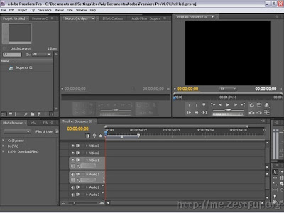
The programmes I have used are Youtube.com, Abobe Premiere 7, Adobe Photoshop 9, Internet Blogger, Microsoft Word, Facebook.com. There has been a noticeable progression in editing from the old ULEAD sotware we used last year. The internet websites I can use freely and easily and helped me to analyse clips and upload videos.
The equipment I have used included Tripod, Mini DV Camera, Tape, Microphone. I have enjoyed using some of the new technology and now feel more confident in using it for future projects.
Shot Evaluation of Teaser Trailer (post production)
We tried to fit in as many shots as possible to get a good range of angles, whilst at the same time only using them when neccessary during the trailer.
For example a close up of the knife that Alex picks up in the phone booth is used to show it's importance in the narrative. How it is used is not yet clear so this shot was also very ambiguous for the audience. Over the shoulder 180 degree rule was kept during shots which included dialogue so as not to disorientate the audience. The scene in the alley-way uses continuity editing to show both characters points of views and reactions to the situation. Though this shot is extended we feel it keeps the flow of the scene moving at a good pace.
We have borrowed two shots from other films of the same genre, whilst manipulating them to suit our own film. The 360 rotation shot from 'Adulthood' is used again at a dramatic point in our film, though we have personalised it by making it low angle and slowing it down to create the effect we were trying to achieve with this. Low angle is prodominently used throughout the teaser trailer to emphasize Alex as the more powerful character holding the most authority. The opposite - high angle - is therefor used regularly for Matt's character (e.g. during the scene in the basketball court) to make him look like the more vulnerable one.
The final shot in which Alex punches the screen ends the trailer in a very aggresive manner, which we feel really works well in putting the point of the film across to the audience. It is taken from 'Shank' though we have zoomed in slightly to make the shot faster and more of a shock to the audience who would not expect it.
By incorporating these two iconic shots into our trailer we are raising the profile of our own film as people will recognize these shots. However by making simple changes to them we have created something new which I feel adds to the originality of our trailer.
Friday, 16 April 2010
Analysis of Empire Magazine Front Cover (post production)

Empire is a well recognized film magazine on a global scale. Therefor it can often afford to put the main image over the top of the magazine name as it is such a well known brand, which not many magazine companies can get away with. This also results in greater advertising of the film the image is representing, which in this case is the new release of 'Clash of the Titans', as it appears to be pushed out of the page and into the reader's focus.
Whilst the striking photo somewhat steals the show, there is still a lot to be seen on the front cover. At the top of the page there is an advertisement for free posters, which is published in bold and even highlighted as this will obviously encourage the reader to buy the magazine. Other similar techniques include the captions 'exclusive interviews' and '30 years of alien' (the 'alien' section will appeal to that particular fan base) which are used by the publisher to entice the audience to read on as they prove to be the main selling points of the magazine. Superlative adjectives such as 'first' and 'hottest' really work in making this magazine sound top of the range despite it having close competitors.
The magazine front cover works in hand with the film being advertised as the font of 'Empire' has been edited to suit the style of the film with a fiery effect. This emphasizes the film as one of great influence and importance to not only the brand but the film fanatics out there as well. The title of the film appears next to the image which clearly dominates the front cover, not only with its size but also the position of the character, the way in which he holds his sword, and the extent to which the light shines on his face. This effect would obviously please the film producers and direcors as lighting, props, costume and setting are all exposed in this one image.
Smaller details such as the barcode, price and date of the magazine are all included and are vital in making the magazine look proffesional. We shall certainly use this technique in our own work to increase the realism established by the front cover.Overall this magazine front cover looks busy with information but crucially evades looking messy which could well be the key to it's success. The use of one main image and two much smaller ones gives a clear idea on the magazine's main focus, and the well arranged text gives the audience a peek into the content of the magazine. Little is given away on the narrative of 'Clash of the Titans' though it is still made to look and sound like an epic film.
Analysis of 28 weeks later Film Poster (post production)

The poster uses a very bold colour to initially attract the reader's attention. The crimson red is an obvious representation of blood and is a strong metaphor of the gory horror narrative that the film follows. The contrast of the white to red used for the eyes and the title is a major give away of the break from normality that the film follows, giving the effect that the blood is taking over.
There is only one image used which is a close up of a person's face wearing a gas mask. This is reminiscant of a world war 2 image which automatically makes the reader feel uneasy, due to the connotations of people being gassed. This knowledge is universal amoungt generations young and old meaning any age of reader can understand and appreciate the sincerity of the image. The feeling of a war or a battle is conveyed through this which ties in with the narrative of zombie vs human. The mask also acts as a way of informing us of the backbone of the storyline which is the spread of the 'rage disease', which has the ability to turn people canabalistic, and peoples attempts at fighting the disease. Other more subtle narrative indicators such as the diffrence in eye colours keep the reader guessing the meaning behind it and what importance it may play in the plot.
The film title is displayed in a relatively central position and uses a bold font meaning it stands out clearly. A slogan is also displayed at the top centre of the page also in white meaning it cannot be missed. 'When days turn to weeks' links this film to it's hugely successful predecessor and is pragmatically very clever due to the hidden meaning it shares with viewers of the last film '28 days later'. The play on words works well in exciting the audience on the latest installment of the film.
The overall layout of the poster creates a big impact and it's simplicity means it is likely to stay in the reader's mind. The important points are clearly put across whilst subtle clues are cleverly implemented. Through the techniques described this film poster achieves everything a film poster aims for and so we may well use this style in our own poster.
Friday, 9 April 2010
Our Unique Selling Point
Our unique selling will always be the hype that is created whenever a film like ours is realeased. The young generations have a real fascination towards crime genres involving their own age group. Therefore we have tried to make it as easy to relate to as possible. We used the Kidulthood film as a role model as the following of this film is still huge some 7 years after its release as a low budget brittish film.
Our poster is simple and can be easily viewed and read. this ill therefore appeal to our target audience who are of the younger age. We have recreated certain shots from films that have alot of poularity to try and bolster the profile of our own film. These shots are obviously in different context but we felt using the shot might increase our films popularity.
Our poster is simple and can be easily viewed and read. this ill therefore appeal to our target audience who are of the younger age. We have recreated certain shots from films that have alot of poularity to try and bolster the profile of our own film. These shots are obviously in different context but we felt using the shot might increase our films popularity.
Evaluation of our Teaser Campaign
Our campaign consisted of a Teaser Trailer for a future film, a teaser poster and a magzine front cover. We have researched and investigated how to produce the best products and have after completion had an audience feedbacjk survey tell us what we did well and not so well.
Teaser Trailer
I believe our teaser trailer was the strongest and most influetial element of our trailer. It Consisted of a range of techniques used to promote the film, its genre and any subsiduary texts that shouls come into existance.
We did this by tring include as much on screen action as possible but not holding a shot for longer than five seconds. I have seen this technique used by alot of teaser trailers and it works to reat effect. We also wanted to include a memorabl;e soundtrack to fit with this screen action. We therefore ensured that the tempo of the song was quick enough and drops in the just the right places.
As far as costume goes we used genaral urban wear to produce our desired effect. The genre we chose was hard to make stand out as far as costume and mise-en-scene go but we felt it best to keep it realistic.
Teaser Poster
Our teaser poster simply backs up our teaser trailer. The images look as if they could ahve been taken directly from the film. We have ensured we keep the costume the same so as to keep the reality of time.
We used fonts very effectively on this product. We feel the font and colour dictate alot to the audience so we spent a long time perfecting this element of the product.We also included some film companies aswell as a tag line to promiote the film further and to keep to the realism of an advertisement campaign.
How effective is our overall product?
Our advertisment campaign has many striong links that then go on and lead to an almost viral effect. If one product is consumed then it requires the others to fit together correctly therefore raising the profile of the film. This means our production fits confortably around the advertisment campaign element.
As a general product i believe our material is a very effective way of gaining popularity and the following of a film. As i mentioned earlier there are links between the tree texts we have created and they all require at least on other text to mak any sense at all. There are mainly focused links between the main product and the ancillary texts and the promotion of the product in general is raised due to the link idea and create a postive connection between the texts.
Our audience feedback would suggest all these points abd this is why we belive our advertisment campaign to ba a success.
Comments On Audience Feedback
Our reaction to the audience responses was slightly suprised but in agreement. We all believed we could have included more action within the trailer but due to limited time had no other option. The strengths of our film that were identified were all elements we were trying to make stand out.
As a production after reading the audience feedback survey we all believe we could improve our work greatly with the results. The strengths identified can be restructured more often in the trailer and the weaknesses replaced or corrected where possible.
Something i have heard prior to the survey is that all our filming looks like its in the same locaton. If we were to repeat this task we would ensure that there are a greater range of locations that we would film in.
Our Audience Feedback Questionaire
Our questionaire consisted on five questions which were to be answered in some detail. Here are the five questions:
What were the films strengths?
What were the weaknesses Of The Film?
How does the trailer challenge convetional views and beliefs?
What could have been done better?
After collaborating the results we got the following points.
Question 1
The camera angles used were varied and often very professional looking.
The soundtrack fits perfectly with the screen action.
There is a varied length of shot time adding to the montage effect.
Question 2
Some of the voiceovers don't sound entirely in character and dont fit with what is going on on screen.
The film appears to follow a narrative and then suddenly doesn't have any continuity at all. This is quite confusing.
Question 3
The film offers a insight into some racially directed sterotypes of the youth culture.
It follows many older generations thoughts on the younger generations today.
Has many key features that would challenge the idea of youth crime and violence.
Question 4
Some of the editing could have been improved to create a more flowing production.
There were too many shots of people walking around and not enough of the action in the film.
Produce an even wider range of camera shots and angles.
Programmes Used Throughout Production
Throughout our production we have generally stuck to using the same programmes for every task. (Ancillary and Main)
Programmes we have used:
Youtube
Abobe Premiere
Adobe Photoshop
Fruity Loops 9
Internet Blogger
Microsoft Word
Because of this we believe our understanding vastly improved and so did the quality of our production work.
Programmes we have used:
Youtube
Abobe Premiere
Adobe Photoshop
Fruity Loops 9
Internet Blogger
Microsoft Word
Because of this we believe our understanding vastly improved and so did the quality of our production work.
Thursday, 8 April 2010
Evaluation Of Equipment
 This is the model of camera we used to film our teaser trialer and the photos for our poster and magazine cover.
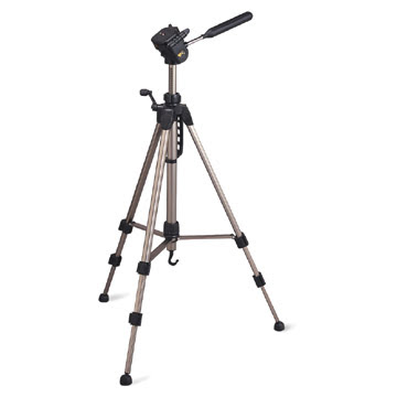
Tripod. Used to create a steadier shot and to film difficult angles.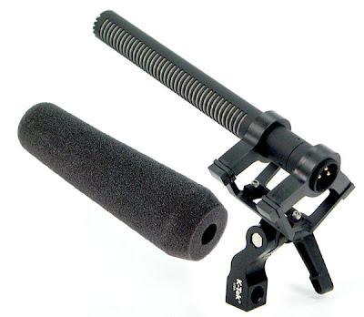
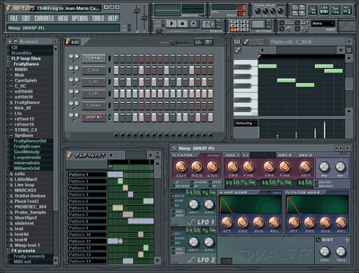
Fruity Loops mixing studio. Used to create the soundtrack in trailer.
Locations of our production work (Marking purposes)
Our teaser trailer is on matthew harrops school area in My Documents due to us being unable to upload it to the blogger.
Our teaser poster is in a similar place only in Matthew Rayburns School Area.
Our Magazine cover should be uploaded by the time you come to mark this.
Our teaser poster is in a similar place only in Matthew Rayburns School Area.
Our Magazine cover should be uploaded by the time you come to mark this.
Empire magazine analysis

The noticable feature of Empire front covers is the contrast between text and imagery. The text completly complements the images and gives brief statements encouraging the audience and cosumer to read on. Aswell as having one main story they also offer many sub stories that amy also appeal to the reader as a commercial product with a need to make money.
What is also noticable is the constant mention of popular actors and directors to further entice the audience to consume the product. The gneral format is simple but at the same time dure to the use of colour it appears busy and almost gives the effect of bursting with 'you' want to read and hear about.
The inclusion of article in film magzines boosts the potential success of a film massively as the ratings go up because of another branch of unforced advertisement. It comes across as impartial but realistically it only displays the film that are believed to be sucessful.
We plan to adopt the use of colour and a busy front cover but at the same time ensure our production is the main focus of the page. The layout is important but if it is more noticable than the article then the production fails. We also plan to adapt the choice of shot used to a more conversational appearence as to encourage the reader that the film isn't all about violence.
G.I Joe Teaser Poster Analysis

The teaser poster for the film G.I Joe was possibly one of the most memorable in my eyes. There is almost no text and the entire profile of the poster is based around the image and title. This works to great effect as audiene knows nothing of the film other than this almost mocking image that denies the viewer any real insight but just makes them consider the appeal enough to investigate it further.
Th costume appears to be the focus of the poster and this is made apparentmost of the poster focusing on this. There are suggestions of the genre through the inclusion of a weapon being held which is often an effective trait of teaser posters and can be traced back a long time.
The colour of the background in comparson withe the character in the shot is interesting as it raises some connotations as to his alligence to good or bad. This is something we may consider in our own production.
In our own production we plan to follow the use of the characters being the focus of the poster idea. It appeals to an audience to see famous faces in a film and this would aid the advertisment potential of our campaign hugely. We also plan to make the \title the sub focus of the product as it is after the selling point of the film.
One thing are planning on doing is leaving the date completly. Not even saying coming soon as it completly dives into the mystery of teaser posters.
Fonts and Colours
We have found through analysis of professional examples that the fonts and colours of the text on teaser posters and magazine covers are a very influential element of the product. We therefore ran a trail of a number of different texts and colours to see which would be most suitable for our chosen genre.
The results suggeted that the best colour would be red with a bold blocky font to suggest the raw appeal and very macho elment of the film. It is targetind at men and we found this research very benifitial.
The results suggeted that the best colour would be red with a bold blocky font to suggest the raw appeal and very macho elment of the film. It is targetind at men and we found this research very benifitial.
Conventions Of Teaser Posters
Teasr posters genrally folow very formulaic and conventional techniques to produce their intended effect. The format and layout are very simple and because of this the audience is caused to imagine alot of what they suggest. This then often leads to the audience wanting to know more therefore, raising the profile of the film.
The imagery is usually very suggestive and often involves the mainfeatures of the film such as the the big name actors/actresses and a hint at the genre of the production through the costume and setting of the shot.
We plan to apply these techniques to our own production and having already produced the image we have applied some of these techniques before the editing process.
Use Of Adobe Photoshop
Throughout the production of both our teaser poster and magazine cover, Photoshop has us hugely. It has enabled us to influence the the appearence of a photo to suit our own purposes and enabled us to produce much more proffesional lookinfg products.
Teaser Poster:
The photo we used to produce our teaser poster consists of the three charaters featured in the teaser trailer and offers an insight into their roles through the the stances they hold. We used photoshop to add layers that affected the distortion, intonation and contrastto help us create the desired effect. We also included a very bold title and tag line from the film to strike out at the audiences attention. Logo's of brittish flm companies were included to make the design appear more real and proffesional. They are always present on teaser posters so we believed ours shouldn't go without.
Magazine:
The production of our magazine cover was very similar tothe production of our poster as both follow quite similar conventions. The photo used for the magazine is less confrontational and more inviting as the purpose is to encourage the reader to read the article. We have also included sections of text togive an insight into the article.
Overall, we found photoshop a very benifitial tool and aid and it helped us generate the best possible product.
Monday, 5 April 2010
Title Sequence In Our Film
In our production we have decided to use a series of titles to help us put our production together. The use of titles in teaser trailers is very popular and it is due to this that we have decided to include them in our own.
It was surprisingly hard uploading the correct fonts and colours and this process actually took longer than the editing of the camera shots. However, the investment of time was well worth it as it has helped us split much of the narrative up and create a montage effect which we considered important in our chosen genre of film.
We have attempted to make the titles catchy as the whole idea of a teaser trailer is to promote the film early on and we hope this has added to the effect. We did try a number of different versions before finally settling on the simple but striking black background with white lettering. This was a good choice we have been told by many on our feedback questionnaires so far and well worth the effort.
King Kong Teaser Analysis

The most previous production of the film King Kong was possibly the most successful. It made a ten times what it cost to make and to the use of CGI footage to a new height. The Director Peter Jackson was critically acclaimed for reinventing an old classic and the teaser trailer more than shows this.
This trailer is longer than most but the effect is not lost through this. It creates a mesmerising sight as the narrative, camera work and editing play a huge role in its success. Forty percent of the film is made up of computerised images and this is what is promoted in the trailer. It is not hard to see that this was the focus of the advertising campaign which proved to be one of the most successful ever. As well as this there is and interesting take on how they put the shots together. Unlike most teaser trailers there is definite following of the narrative and the use of voiceovers from the film during shots that do not actually contain these is very effective in also giving the editing a form of montage and yet still following the narrative.
What is also effective is the use of sound and how it always seems to relate to the on screen activity. The mood music works extremely effectively and transfers the meaning of the scene to the audience with ease. This is a technique we may try to us in our production but could possibly find hard due to the use of a soundtrack and voice over dialog.
I also found the use of props and costume very realistic in this trailer. I believe that the more realistic a film appears the more the audience can emotionally connect with the narrative and therefore I shall be considering these elements very carefully in my own production and casting.
The use of a very vague release date for the film was an interesting technique as it leaves the audience to find out the rest and want to know more. This shall be used in our production as it adds to the compatibility of the teaser trailer and the conventions that go hand in hand with it.
4.3.2.1 Teaser Analysis

This Film is due to be released at some point in 2010 but the producers have kept the date disclosed to add the viral marketing campaign they are trying to create. It is a Britsh production and again features many of the cast from the cult classic Kidulthood. This is also a feature that will aid the viral effect of the advertising campaign. The director is Noel Clarke who is becoming somewhat known for creating films in the genre of British Youth Crime and doing so extremely successfully
The trailer is very short even by the typical teaser trailer conventions but this makes the effect much more intense. There are two shots used and little non diagetic sound and the atnosphere created by this technique is most interesting. It makes the audience start contimplating what may happen next more effectively than any other teaser trailer i have seen and therefore makes for hugely effective promotion of the film.
The use of subtitles is interesting in this trailer. Usually and conventionally subtitles are either used to describe the narrative or to introduce a scene. This particular trailer uses them to ask questions of the audience and creates a slightly mysterious style that gives much greater conviction to what has just been viewed on screen.
We plan from looking at this trailer to try to adopt a similar approach to the title sequence. As we found this technique so effective we have decided to boorw some of these conventons and apply them to our own production in the hope that despite our version being longer the effect shall remain the same.
Subscribe to:
Comments (Atom)