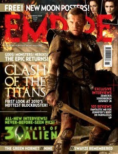
Empire is a well recognized film magazine on a global scale. Therefor it can often afford to put the main image over the top of the magazine name as it is such a well known brand, which not many magazine companies can get away with. This also results in greater advertising of the film the image is representing, which in this case is the new release of 'Clash of the Titans', as it appears to be pushed out of the page and into the reader's focus.
Whilst the striking photo somewhat steals the show, there is still a lot to be seen on the front cover. At the top of the page there is an advertisement for free posters, which is published in bold and even highlighted as this will obviously encourage the reader to buy the magazine. Other similar techniques include the captions 'exclusive interviews' and '30 years of alien' (the 'alien' section will appeal to that particular fan base) which are used by the publisher to entice the audience to read on as they prove to be the main selling points of the magazine. Superlative adjectives such as 'first' and 'hottest' really work in making this magazine sound top of the range despite it having close competitors.
The magazine front cover works in hand with the film being advertised as the font of 'Empire' has been edited to suit the style of the film with a fiery effect. This emphasizes the film as one of great influence and importance to not only the brand but the film fanatics out there as well. The title of the film appears next to the image which clearly dominates the front cover, not only with its size but also the position of the character, the way in which he holds his sword, and the extent to which the light shines on his face. This effect would obviously please the film producers and direcors as lighting, props, costume and setting are all exposed in this one image.
Smaller details such as the barcode, price and date of the magazine are all included and are vital in making the magazine look proffesional. We shall certainly use this technique in our own work to increase the realism established by the front cover.Overall this magazine front cover looks busy with information but crucially evades looking messy which could well be the key to it's success. The use of one main image and two much smaller ones gives a clear idea on the magazine's main focus, and the well arranged text gives the audience a peek into the content of the magazine. Little is given away on the narrative of 'Clash of the Titans' though it is still made to look and sound like an epic film.
No comments:
Post a Comment