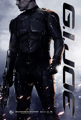
The teaser poster for the film G.I Joe was possibly one of the most memorable in my eyes. There is almost no text and the entire profile of the poster is based around the image and title. This works to great effect as audiene knows nothing of the film other than this almost mocking image that denies the viewer any real insight but just makes them consider the appeal enough to investigate it further.
Th costume appears to be the focus of the poster and this is made apparentmost of the poster focusing on this. There are suggestions of the genre through the inclusion of a weapon being held which is often an effective trait of teaser posters and can be traced back a long time.
The colour of the background in comparson withe the character in the shot is interesting as it raises some connotations as to his alligence to good or bad. This is something we may consider in our own production.
In our own production we plan to follow the use of the characters being the focus of the poster idea. It appeals to an audience to see famous faces in a film and this would aid the advertisment potential of our campaign hugely. We also plan to make the \title the sub focus of the product as it is after the selling point of the film.
One thing are planning on doing is leaving the date completly. Not even saying coming soon as it completly dives into the mystery of teaser posters.
No comments:
Post a Comment