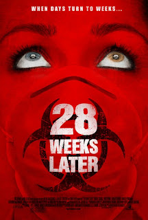
The poster uses a very bold colour to initially attract the reader's attention. The crimson red is an obvious representation of blood and is a strong metaphor of the gory horror narrative that the film follows. The contrast of the white to red used for the eyes and the title is a major give away of the break from normality that the film follows, giving the effect that the blood is taking over.
There is only one image used which is a close up of a person's face wearing a gas mask. This is reminiscant of a world war 2 image which automatically makes the reader feel uneasy, due to the connotations of people being gassed. This knowledge is universal amoungt generations young and old meaning any age of reader can understand and appreciate the sincerity of the image. The feeling of a war or a battle is conveyed through this which ties in with the narrative of zombie vs human. The mask also acts as a way of informing us of the backbone of the storyline which is the spread of the 'rage disease', which has the ability to turn people canabalistic, and peoples attempts at fighting the disease. Other more subtle narrative indicators such as the diffrence in eye colours keep the reader guessing the meaning behind it and what importance it may play in the plot.
The film title is displayed in a relatively central position and uses a bold font meaning it stands out clearly. A slogan is also displayed at the top centre of the page also in white meaning it cannot be missed. 'When days turn to weeks' links this film to it's hugely successful predecessor and is pragmatically very clever due to the hidden meaning it shares with viewers of the last film '28 days later'. The play on words works well in exciting the audience on the latest installment of the film.
The overall layout of the poster creates a big impact and it's simplicity means it is likely to stay in the reader's mind. The important points are clearly put across whilst subtle clues are cleverly implemented. Through the techniques described this film poster achieves everything a film poster aims for and so we may well use this style in our own poster.
No comments:
Post a Comment