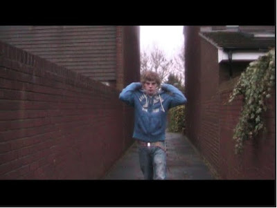
This shot was taken a the first of a three shot sequence. We felt a mid shot was appropriate to give a general view of the scene aswell as the character. This was an unusual technique to use in a teaser trailer but we felt the sequence was approriate to give the audience an insight to the narrative. The fact that the alleyway is quite narrow also means that the shot looks almost surreal at points contributing to the idea of helpness which was the intended message in this shot and sequence.
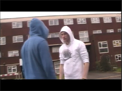 This shot was an interesting one. It took a number of attempts to get right but we felt it was quite original. The content of the shot is a full 360 degrees around the two subjects and gives the intention of violence an extra edge that makes it particularly effective. The shot idea was originally gained from the film adulthood but we adapted it to fit our own purposes for the trailer.
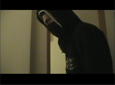 This shot is possibly one of the more aggressive and threatening of the trailer. It uses the simple camera movements of a sideways pan to follow the action on screen. We used low lighting to raise connotations of a darker scene and the action on screen suggests this.
 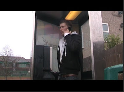 This shot is a low angled shot and again was part of a three shot sequence. We later added a voice over for the dialog as we considered this to be a good use of time. It vastly improved the quality of the general sound and ensured that any interference was illiminated. we held the shot a little longer than we did for others as it is a pivotal moment in the films narrative. It is also a very heavily lit shot so every elment of the cosyume had to correct.
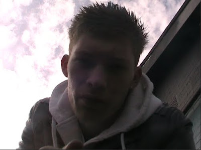 This was a particularly hard shot to get right. As its an extreme low angle it was impossible for the person operating the camera to see the shot. Therefore it was down to guesswork how to do the shot. eventually we got it right however and we feel the end product was worth it. We didn't use a voice over in this shot as the subject was so close to the microphone we didnt feel it neccessary. The light from behind also gives a silouette effect which contributes to the mood created.
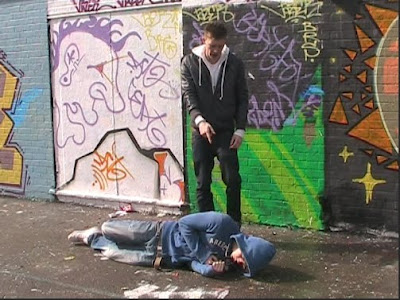 This is second shot of a two shot sequence and is the last longer shot og the trailer. It is held for 3 seconds and we decided on a mid shot as it helps include everything we wanted in the shot. We also used a small pan movement to follow one of the subjects out of the scene towards the end of the scene.
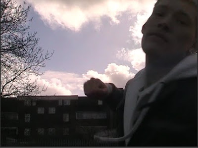
This is everyones favourite shot of the production. It is possibly the shortest shot but involves the subject punching the screen of the camera and the relaease date appearing as a result. we borrowed the idea from the teaser trailer for 'Shank' and we personally feel we easily matched the quality. The camera is in a low angle position and we did this to get the sky in the background as back lighting. This effect is possibly the most fitting for any shot in the entire production.
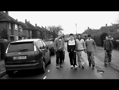
 This shot is a long shot of one of the characters. It is used as a mood shot at the very beggining to set the genre of the production aswell as give a hint to the general content. This is before the soundtrack drops and is used as an oppertunity to build a mood in the trailer. We believe this worked effectively and created the mood intended.
By Alex, Matt H, Matt R.
No comments:
Post a Comment